I haven't had a Field Trip Friday in awhile, mostly because I haven't been around too many Fridays. But, on Sunday, I did visit a model home, one of my favorite things to do. To me it ranks right up there with shopping.
Of course, for the last couple of years there have not been as many model homes, as there have not been that many new home sales. In my part of the world, Northern Virginia (and for you out-of-towners, we always differentiate ourselves by saying Northern Virginia - there really should be 2 states - but that is a story for another blogpost)the economy has been bouncing back and we are starting to see a lot more home builder signs. New developments are popping up and some others that weren't quite complete are starting to fill in.
I love all the new ideas I get from my "tours".Plus it is a great way to gauge design and color trends.
I visited Huntleigh at Creighton Farms, which I believe is an Aldie address. The builder is Stanley Martin. Hey, if you are a golfer, they have a really good deal right now. If you buy one of their new homes, they pay the initiation fee for you to join the golf club at Creighton Farms. The clubhouse is nearing completion and it if SOOOOO beautiful. And Aldie is perched on the edge of Virginia Hunt Country. Views of the Blue Ridge Mountains could be seen from the neighborhood.
This particular model was a study in the use of black, white and blue. Really sophisticated. I was only able to take a few photos - and so sorry; as usual with model homes you don't know who the designer is, so I am unable to give credit.

I loved this piece of furniture. If anyone knows where it came from let us all know! This was set up as a casual wine bar. It was also a bit of design strategy. This piece is sitting where your kitchen table would be. See the sunroom/breakfast room on the right of the picture where the table is? That is an optional room, that you would pay extra to get. It certainly made the entire kitchen more grand.
Another view of the wine bar:

Here's the kitchen. Don't you love the mix of black and white cabinetry? You can't see the granite which was beautiful and subtle. I really like the barstools and those nailheads fit the scheme perfectly. Where can I get that gigantic centerpiece with the fake artichokes??

Here is a view of the optional breakfast room and my favorite idea of the day. Look at those XXL boxwood spheres! They are hung from tiny white hooks in the ceiling on fishing line. There is also a huge silver candleabra on the table. By now you may have noticed that most of the accessories and artwork are oversized.

A view of the master bedroom and it's gentle mix of black, whites and gray-blues.

Here's a closeup of the bedroom window treatments. It is hard to see the wallpaper, which was only in the sitting room area, but was so discreet and pretty.

One of the bedrooms, decorated for a child, was cute and introduced a little of the color red. Love the burlap bunnies.


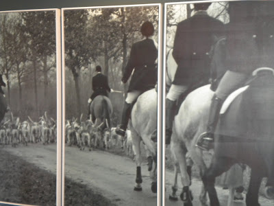
Finally, this triptych of photos that is shown at the beginning of this post is actually hung in the upstairs hallway. A view of the hunt - very Virginia.


